Modal
Our modal is one of the most tricky libraries to implement.
We do some things differently here to be able to have one single modal element in our Layout and access it with different configurations. We do this because our modules and heros make use of the modal and it’s easier to work with dynamic purposes for this modal if we have only one element and play around with HTML attributes to add variations.
We have a single Modal component that can look something like this:
<div id="my-modal" class="c--modal-a js--modal" aria-hidden="true"> <div class="c--modal-a__overlay" data-modal-close></div> <div class=" c--dialog-a"> <h2 class="c--dialog-a__title">Modal Title</h2> <button class="c--dialog-a__btn" data-modal-close> × </button> <div class="c--dialog-a__content"> <p> Lorem ipsum dolor sit amet consectetur adipisicing elit. Vitae molestiae, iusto cumque quis maxime consequuntur voluptatibus obcaecati vel autem commodi explicabo! Corporis sapiente autem dolorem inventore suscipit molestias omnis culpa! </p> </div> </div></div>And we import this in our Astro Layout (or its equivalent in WordPress, basically the template where our header and footer are and that is always present in the page)
<body>    <!-- Google Tag Manager (noscript) -->    <HeaderA/>    <PreloaderA />    <TransitionA />    <LoaderA/>
    <main id="swup">      <slot />    </main>
    <FooterA/>
    <ModalA />  </body>
This ensures our modal is always available to be displayed. And we will control everything that happens inside the modal and its contents via JS.
To activate our modal we need a trigger, which will usually be a button:
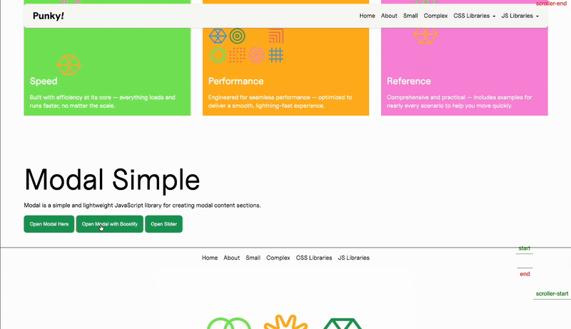
<div class="f--col-12"> <button data-modal-open="my-modal" class="c--btn-a js--modal-button"> Open Modal Here </button> <button data-modal-open="my-modal" data-modal-variation="video" class="c--btn-a js--modal-button" data-modal-video-url="http://placeholder.terrahq.com/1-min-video.mp4" > Open Modal with Boostify </button> <button data-modal-open="my-modal" data-modal-variation="slider" class="c--btn-a js--modal-button"> Open Slider </button></div>Here we see three buttons that activate three different variations of our modal.
The first one is a generic modal that will display just the text that is in our HTML element.
The second one is a video modal, so we send the variation we want (which we will pick up in our Handler) and the URL of the video we want to load.
The third one integrates a library in library, further explanation below and here.
Our handler looks the same as other classes but there are two main differences.
First, since we use the same element for all of our modals, although we have different configurations, we will be using the same one with a switch inside, so we do not differentiate between elements (again, because we only use one). This allows us more flexibility since we don’t need to create new modals for each variation, and we can make do with our buttons to differentiate the content inside the pop up.
    constructor(payload) {        super(payload);        this.init();        this.events();
        this.config = ({element}) => ({            selector: document.querySelector(".c--modal-a"),            openClass: "c--modal-a--is-active",            beforeOpen: (modalEl, trigger) => {                const dialogContent = modalEl.querySelector(".c--dialog-a__content");                const variation = trigger?.element?.getAttribute("data-modal-variation") || "default";                const paragraph = dialogContent.querySelector("p");                resetDialogContent({ dialogContent, paragraph });
                switch (variation) {                    case "video":                        videoVariation({ boostify: this.boostify, dialogContent, paragraph, trigger });                        break;
                    case "slider":                        sliderVariation({ eventSystem: this.eventSystem, dialogContent, paragraph });                        break;
                    default:                        defaultVariation({paragraph})                }            },            onClose: (modalEl, trigger) => {                handleOnClose({                    modalEl,                    trigger,                    eventSystem: this.eventSystem                });            },        });    }
You can see also that we are importing our variations from an external file, because they can be quite lengthy and we want to keep our handler clean.
Second, since our element is always present (because it’s in our Layout), we don’t want to load our library depending on the modal itself, and we will use the buttons. So if a button that opens a modal is present, we will activate our class.
get updateTheDOM() { return { modalButton: document.querySelectorAll(".js--modal-button"), }; }And we use these buttons to instance our class:
this.emitter.on("MitterContentReplaced", async () => {    this.DOM = this.updateTheDOM;
    super.assignInstances({        elementGroups: [            {                elements: this.DOM.modalButton,                config: this.config,                boostify: { method: "click", distance: 30 },            },        ],    });});
You’ll notice one more thing: we are using boostify click instead of scroll to load the library. This is because we want to create the instance when we click the button and not before, so if we don’t click it, it never instances and we save a bit of computing.
Since we instance it on click, we need to destroy our instance when we close our modal, so our instances don’t intersect and we don’t end up with a bunch of instances that are never destroyed.
That’s why we use our custom Modal:destroy event, which we will call from the onClose callback inside our modal configuration:
this.config = ({element}) => ({ ... onClose: (modalEl, trigger) => { handleOnClose({ modalEl, trigger, eventSystem: this.eventSystem }); }, });export function handleOnClose(payload) { const { modalEl, eventSystem } = payload; if (!modalEl) return;
const dialogContent = modalEl.querySelector(".c--dialog-a__content"); if (!dialogContent) return;
const hasSlider = dialogContent.querySelector(".js--slider");
dialogContent.querySelectorAll(".js-modal-dynamic").forEach((el) => el.remove());
if (hasSlider) { eventSystem.destroyEvent({ library: "Slider", where: "Modal" }); }
eventSystem.destroyEvent({ library: "Modal", where: "Modal" });}this.emitter.on("Modal:destroy", () => { if (this.DOM.modalButton.length) { super.destroyInstances(); }});So when we close our modal, we activate its onClose method, we do internal cleanup and we fire our destroyEvent, which will activate the external class’ destroy method.
Custom class
Section titled “Custom class”We need a custom class to use our modal library because we are going to instance and open our modal on boostify click.
Since we need some custom behaviour added to our external library, we need to add a custom class.
import Modal from "@terrahq/modal"
class ModalClass{    constructor(payload) {        // Destructure to separate element from modal configuration        const { element, el, ...modalConfig } = payload        this.config = modalConfig        this.triggerElement = element || el
        this.init()    }
    init(){        this.modal = new Modal(this.config)
        // Pass trigger information when opening the modal        const triggerInfo = {            type: 'boostify',            element: this.triggerElement,            id: this.triggerElement?.id || null,        }
        this.modal.open(this.config.selector, triggerInfo)    }
    events(){
    }
    destroy(){        this.modal.destroy();    }}
  export default ModalClass;
We have a very simple class:
- We import the external class here, since this file will be the one included in
resources, the external class will only get imported when this one does - Our constructor gets the information from our Handler and separates the element from the modal configuration
- Our
ìnitmethod instantiates the modal class and gets the trigger info to execute itsopenmethod, so our modal will be instantly opened once the class is instanced - Our
destroymethod executes thedestroymethod from the Modal class
So the result is that, on Boostify click, our custom class will instantiate the Modal class (which our regular handler would have done if we used it directly) but it will also open it, which would not have happened if we used our external library in the handler directly.
Knowledge Check
Test your understanding of this section
Loading questions...