Creating HubSpot Landing Pages
HubSpot landing pages are standalone web pages designed to capture visitor information through lead forms. They are powerful tools for running marketing campaigns, promoting offers, and driving conversions. HubSpot’s landing page builder provides an intuitive platform to create high-converting pages without extensive coding knowledge.
Key Benefits:
Section titled “Key Benefits:”- Drag & Drop Editor for Visual Building
- Custom Code Editor for Advanced Customization
- Built-in Analytics and A/B Testing
- Seamless Integration with HubSpot CRM
- Optimized for SEO and Mobile Responsiveness
Drag & Drop Editor (Visual Builder)
Section titled “Drag & Drop Editor (Visual Builder)”The drag & drop editor is HubSpot’s visual interface for creating landing pages. It allows you to build pages by arranging pre-designed components and customizing their appearance and behavior.
Accessing the Editor
Section titled “Accessing the Editor”- Log in to your HubSpot account
- Make sure you are in the correct
Client Account - Navigate to
Content > Landing Pages - Click
Create Landing Page - Choose whether to create a blank page using the drag & drop builder, or start with a pre-built template
- You will be prompted to name your new landing page
The Editor
Section titled “The Editor”The HubSpot drag & drop editor allows you to visually build landing pages by arranging modules on a page canvas.
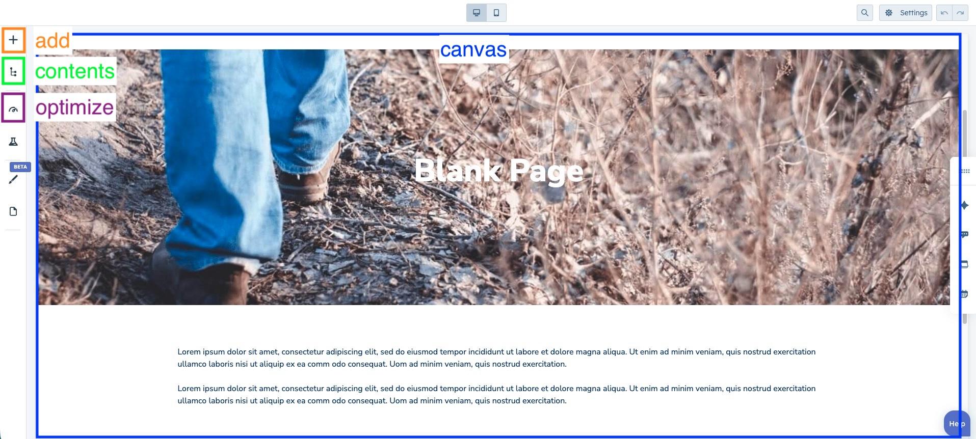
The editor is divided into several key areas:
- Canvas – The main workspace where you build the page layout.
- Add – Opens the module library to drag components onto the page. Here you can also select custom modules created specifically for the project.
- Contents – Displays the hierarchical structure of all sections and modules.
- Optimize – Provides tools for SEO configuration and optimization.
Custom Templates and Modules
Section titled “Custom Templates and Modules”In some projects, landing pages require layouts or components that go beyond HubSpot’s default functionality. In these cases, developers can create custom templates and custom modules using HubSpot’s Design Tools.
These custom elements allow teams to maintain consistent design patterns while providing reusable components.
Creating a Custom Module
Section titled “Creating a Custom Module”Custom modules allow developers to create reusable components with predefined functionality, styling, and configuration options.
To create a custom module:
- Navigate to
Content > Design Manager - Click
File > New File - Select Module
- Choose where the module will be used (Landing Pages, Emails, etc.)
- Define the module fields (see Configuring Module Fields)
- Add custom HTML, CSS, or JavaScript if needed (see Adding Custom Code)
- Save and publish the module
Once published, the module will appear in the Add panel of the drag & drop editor and can be used in landing pages that support custom modules.
Configuring Module Fields
Section titled “Configuring Module Fields”Module fields define the content that users can edit when using the module.
In the module inspector on the right, click Add field and select the field type you want to create.
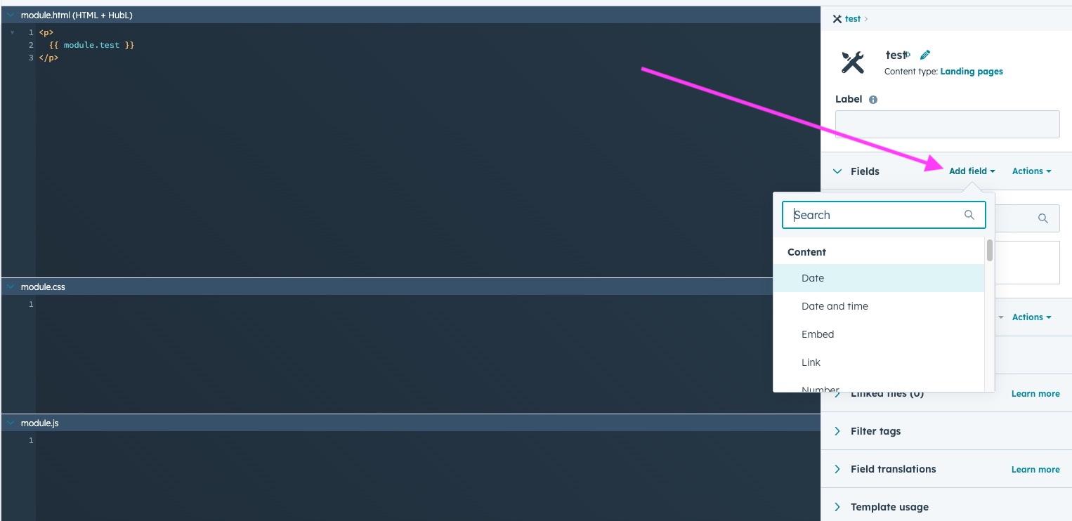
Fields can also be configured with additional options such as:
- Required fields
- Conditional visibility (show fields only when another field meets a condition)
The most common field types include:
Content Fields
Section titled “Content Fields”- Text – Single-line text input.
- Rich text – WYSIWYG editor for formatted content.
- Link – Used to create links. Typically requires two fields:
- a Link field (URL)
- a Text field (link label)
- Date – Allows the user to select a date.
Logic Fields
Section titled “Logic Fields”- Boolean – A true/false toggle. Often used to show or hide content conditionally in the module code.
Selector Fields
Section titled “Selector Fields”- Image – Allows the user to select an image.
- Form – Allows selecting a HubSpot form to embed in the module.
Grouping Fields
Section titled “Grouping Fields”Fields can be grouped to organize related settings or reuse structured content.
To group fields:
- Click Group
- Select the fields to include
- Give the group a name
Grouping fields helps keep the module configuration organized and the code easier to maintain.
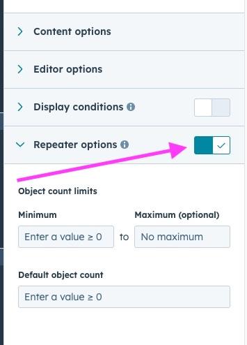
Making Fields Repeatable
Section titled “Making Fields Repeatable”Fields or groups can be made repeatable, allowing users to create multiple instances of the same content.
For example, this can be used for:
- lists of features
- testimonial sliders
- image galleries
To make a field or group repeatable:
- Select the field or group
- Enable Repeater options
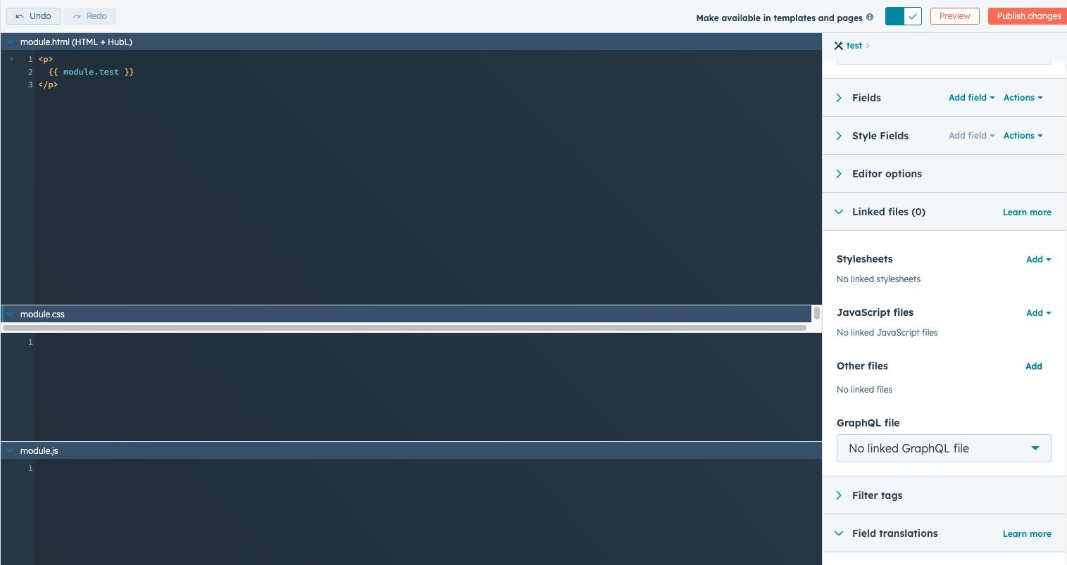
Using Fields in the Module Code
Section titled “Using Fields in the Module Code”Once fields are created, their values can be inserted into the module code.
Click Actions on a field to access two options:
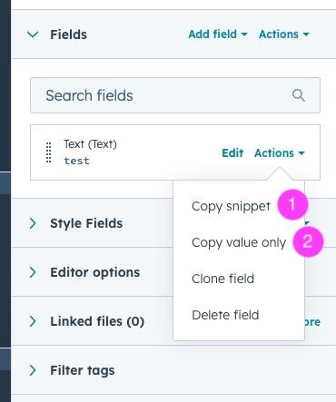
- Copy snippet (1) – Used for complex fields like images or groups.
- Copy value only (2) – Used for simple fields.
For simple fields such as text, you can insert the value directly:
<h2>{{ module.text_field }}</h2>More complex fields generate a full snippet that handles multiple attributes.
Example for an image field:
{% if module.image_field.src %} {% set sizeAttrs = 'width="{{ module.image_field.width }}" height="{{ module.image_field.height }}"' %} {% if module.image_field.size_type == 'auto' %} {% set sizeAttrs = 'style="max-width: 100%; height: auto;"' %} {% elif module.image_field.size_type == 'auto_custom_max' %} {% set sizeAttrs = 'width="{{ module.image_field.max_width }}" height="{{ module.image_field.max_height }}" style="max-width: 100%; height: auto;"' %} {% endif %} {% set loadingAttr = module.image_field.loading != 'disabled' ? 'loading="{{ module.image_field.loading }}"' : '' %} <img src="{{ module.image_field.src }}" alt="{{ module.image_field.alt }}" {{ loadingAttr }} {{ sizeAttrs }}>{% endif %}You can simplify this snippet depending on your module needs.
Adding Custom Code
Section titled “Adding Custom Code”Custom modules can include their own HTML, CSS, and JavaScript to control structure, styling, and behavior.
Developers can define:
- HTML for the module markup
- CSS for component styling
- JavaScript for interactions or dynamic behavior
In addition to writing code directly inside the module, you can also link external files from the module inspector, such as:
- Stylesheets for shared or larger CSS files
- JavaScript files for reusable scripts
- Other files required by the module
Linking external files can help keep modules cleaner and allows code to be reused across multiple components.
This allows modules to encapsulate both the visual structure and functionality of reusable components.
Creating a Custom Template
Section titled “Creating a Custom Template”A custom template defines the overall structure of a landing page. It controls the layout and determines which modules can be used within the page.
To create a custom template:
- Navigate to
Content > Design Manager - Click
File > New File - Select HTML + HubL
- Choose Template
- Configure the layout by adding module groups and sections
- Save and publish the template
To add a custom module to the template, copy the usage snippet provided in the module settings. You can find it in the module editor under Template usage (bottom right panel).
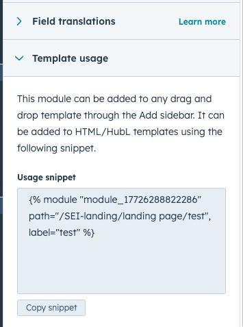
Copy the snippet and paste it in the template where you want the module to appear.
Once published, the template will be available when creating new landing pages.
Publishing Your Landing Page
Section titled “Publishing Your Landing Page”Before publishing your landing page, make sure to configure its SEO and metadata settings.
SEO and Metadata
Section titled “SEO and Metadata”- Page Title and Meta Description
- URL Path and Slug
- Open Graph Image
- Robot Instructions (index, follow, etc.)
Publishing
Section titled “Publishing”Once you’ve completed building and testing your landing page:
- Connect a custom domain (optional)
- Review and test the landing page
- Click
Publishto make it live
Your landing page will now be accessible to visitors. Monitor its performance using HubSpot’s analytics tools and make iterative improvements as needed.
Knowledge Check
Test your understanding of this section
Loading questions...